Going Through The 2018 NHL 3rd Jerseys...So Far

Entry posted by oilfieldhockey
474 views
There is a common theme with most of the NHL 3rd jersey releases in 2018. They're nostalgic and simple. Many of the 3rd jerseys were alterations of the previous Stadium Series jerseys worn by some of the teams. Others, were completely new with a resemblance of Deja Vu infused in the sweater. It's definitely familiar, except now Adidas is branded onto the jersey where as before, it was Reebok's duty.

Anaheim Ducks
This modern classic was released for the 25th anniversary season for the Anaheim Ducks and it tried to touch as many parts of the Ducks history as it could.
Anchored in black, the third jersey features the original "Mighty Ducks" crest with eggplant and jade striping from the Ducks iconic look of its inaugural 1993-94 season. Linking the team's past and present, the jersey incorporates new into old with a touch of the Ducks current orange coloring represented in the crossed hockey sticks of the team's original mark. Anaheim's current jersey number and letter styling is used in the new third sweater, providing a cohesive and integrated look to the team's 2018-19 uniform kits, while the interior collar denotes the franchise's 25th silver season. The first of its kind to subtly incorporate each of the seven colors (Eggplant, Jade, Anaheim Ducks Orange, Anaheim Ducks Gold, Anaheim Ducks Silver, White and Black) the Ducks have worn throughout the club's 25-year tenure, the jersey also features silver as a primary accent color in both the triangle of the crest and yoke, paying tribute to the team's generational milestone.

St. Louis Blues
This is the exact same jersey the Blues wore in their Winter Classic game versus the Chicago Blackhawks in 2017. These sweaters were the original jerseys that the Blues wore when they became a team in 1967. A great choice for a winter classic.
The only main difference is the neck. This version bears the silver NHL logo that Adidas has placed on all their jerseys. The inside of the neck also has the St. Louis flag design that has been on the inner portion of all the Blues jerseys since Adidas took over jersey manufacturing for the NHL.

Colorado Avalanche
Inspired by the logo of the Colorado Rockies hockey team that played in Denver from 1976-82, as well as the state's topography, the Avalanche's third jersey is both a statement of regional pride and hockey history. By fusing the terrain of the Rocky Mountains with elements from the state flag, the crest features the "C" from Colorado's state flag and places it in the center of a triangular mountain design. Additionally, the navy-base jersey has white shoulder yokes to evoke the look of snow-capped mountain peaks, while a shoulder patch of the Colorado state flag sits atop the left shoulder.

Columbus Blue Jackets
Now on the more modern Adidas jersey cut, the uniform features a main crest which includes a depiction of the 1857 Napoleon Cannon stationed at Nationwide Arena, the cannon in/famous for firing after every Blue Jackets goal at home. The cannon is surrounded by a Civil War medal-inspired ribbon with a star at its base in recognition of Columbus being the state capital of Ohio.
The logo features the team name on a banner that circles around a cannon – a symbol iconic to the franchise. The Blue Jackets first debuted the cannon in 2007 and fire it off when the home team scores a goal. They have even incorporated the cannon into their goal song, AC/DC’s “For Those About to Rock (We Salute You)”.
All the other details from this jersey’s first go-round have been carried over to the new uniform, the inside collar again says “We Fight, We March!”; the name and number font remains the same as the home and road set. The interior of the jersey has ten embroidered stars which were originally added in recognition of the club’s tenth anniversary from 2009.

Winnipeg Jets
Going with their lighter “aviator blue”, a secondary colour from the team’s home and road set as the base, it’s the new word mark across the chest that’s the star of this design. This new word mark features “Jets” in a new white script with the “t” crossed using the outline of a fighter jet. This wordmark also becomes the new official team word mark logo, replacing the previous logo introduced in 2011.
The large white stripes on each arm and around the waist were directly inspired by the jersey the original Winnipeg Jets wore in their final few seasons before moving to Phoenix in 1996.
There are no shoulder decorations as this jersey is a very simple and low-key design. A nice touch is added to the inside collar, “WE ARE TRUE NORTH”, a nod to the fans who scream out “True North!” during the Canadian National Anthem before each home game.

Calgary Flames
A throwback to the road red uniform the team first wore as they moved from Atlanta in 1980, Calgary had originally worn this uniform for their first fifteen years, including for two trips to the Stanley Cup Final and a championship in 1989. The design has, of course, been updated to fit on the Adidas jersey style.
It’s that Stanley Cup anniversary that’s being cited as the reason for the return of this classic uniform (30 years since they last won), the Flames were wearing these road reds in Montreal as they hoisted the Cup for that first and only time in franchise history; in fact, it’s the only time a visiting club ever won the Stanley Cup at the Montreal Forum.
Like the 1980-94 design, this uniform is red with white and gold striping at the waist and on each sleeve; on the chest is the Flames familiar flaming-C logo in white with gold trim. The Flames had previously brought this uniform back as a “throwback” for their 30th anniversary season in 2009-10 before making it their official alternate uniform for 2010-11 through 2012-13, the uniform was brought back a second time as an alternate uniform for the 2016-17 season.

San Jose Sharks
The Sharks are calling it their “Stealth Jersey” becuase it has been "blacked-out". Its colours and re-coloured logos, all traces of orange from their primary logo on the chest has been eliminated aside from the eye of the shark, replaced with black and teal, even the hockey stick is now teal. The team’s classic shark-fin logo returns for the first time in over a decade, also re-coloured. The popular secondary logo graced the shoulder of the Sharks uniforms from their inaugural season in 1991 through 1998 and then returned for their alternate uniform from 2002 to 2007.
It’s not all about the “stealth” with this new set, there’s also a nod to the San Jose area’s important role in the world of technological advances with the addition of a subtle microchip pattern in between the two teal sleeve stripes; they’re saying the pattern forms a series of “SJ". The incorporation of this microchip pattern is also to establish the Sharks as “the team of the future”.

Washington Capitals
Throwing back to the road red uniform the club wore for their first 20-odd seasons, the jersey features the original team logo across the chest in white with a blue hockey stick, and six stars alternating between white-and-blue across the top and five down each sleeve. The collar is white with a white shoulder yoke, at the waist are two large stripes, one blue and one white. Blue pants and red helmets will be worn, the pants also with the star pattern down each side.
The uniform is the same design the team wore as their alternate uniform during the 2015/16 and 2016/17 seasons, even carrying over the incorrect colouring of the WASHINGTON word mark on the logo; during the original run of this uniform design, this element of the logo was actually blue.
Washington began wearing this uniform style for their expansion season in 1974-75, with a few minor tweaks over the years it was worn through the end of the 1994-95 season before being radically replaced with a blue/black/bronze design featuring an eagle on the chest and diagonal striping. In 2007-08 the Caps returned to a modernized version of their original set and brought back their white version as an alternate uniform in 2011-12; the white alternate was worn for four seasons when it was replaced with a more practical red version allowing the team to wear it for home games.

New York Islanders
Creating a new signature look, the alternate jersey features a re-designed "NY" crest, modernized to be more symmetrical. The descending "Y" hockey stick has been shortened and strengthened to give it a more balanced appearance. The four iconic stripes have been moved down to the blade to prominently celebrate the Islanders' historic consecutive Stanley Cup Championships. The jersey includes subtle nods to the team's heritage with a color palette, refined striping system, and orange numbering reminiscent of the team's inaugural 1972-1973 blue sweater. Other subtle details include a graphic of Long Island on the interior neckline, a designation of Long Island pride, and a block-lettered "ISLANDERS" moniker that sits just above the Adidas logo on the exterior neckline.

Philadelphia Flyers
The jersey is a direct copy of their 2017 Stadium Series uniform, minus the commemorative patches. The all-black uniform with large orange stripes was already alluded to as being their third jersey during a fan event early in 2018.
The difference between this jersey and the Stadium Series version is the imprint of "PHILADELPHIA" inside the neck portion of the jersey.

Pittsburgh Penguins
The new design incorporates elements from the popular 2017 Stadium Series uniform while acknowledging the heritage of gold jerseys worn by Mario Lemieux and the Penguins in the 1980s.
Creating a signature look for these new thirds, the crest spotlights the standalone skating penguin on a single-toned gold sweater. Mixing the past with the present, the contrasting black sleeves are highlighted with white and gold striping that are inspired from the Penguins' 1984 jerseys, while the letters and numbering mirror the current home and away jerseys. Additional design details include the sleeve numbers being raised to the shoulder of the jersey to mimic the 1980s look.

Carolina Hurricanes
The Carolina Hurricanes are advising you take warning to the fact the club has unveiled their new alternate/third uniform, one which updates some old looks worn by the club while also introducing some North Carolina state pride.
Like their previous one, the Canes use the secondary team colour of black as the base while also modifying the logo on the chest.
Front-and-centre we see a new hurricane warning flag logo, yes – it’s actually a hurricane warning flag this time – with two flags flying from the stick instead of one, another nod to North Carolina hidden in-between the two flags.
The shoulder yoke is now a storm grey with a red trim and includes two “ghosted out” tonal grey logos – the Hurricanes primary logo on the right shoulder and the state flag of North Carolina on the left shoulder.
Throughout the uniform we see several red stripes, all of which include a heathered pattern.

Arizona Coyotes
Like some sort of mythical bird whose name I just cannot recall, the Phoenix Coyotes original Kachina uniforms have returned.
Banking on a wave of 90’s nostalgia, the Arizona Coyotes introduced their new throwback third uniforms tonight at their NHL Draft party. The uniform was worn originally for the Coyotes first seven seasons following their relocation from Winnipeg in 1996 before it was replaced in the fall of 2003 as the current logo made it’s debut.
The uniform is a fairly faithful reproduction of the original Coyotes uniform, even nailing the unique striping pattern around the waist, sleeves, and at the collar. Both logos are back, the coyote on the chest as well as the moon mark on the shoulder, albeit updated to no longer read “Phoenix” instead leaving it blank above "Coyotes", due to the name change the team underwent in 2014.
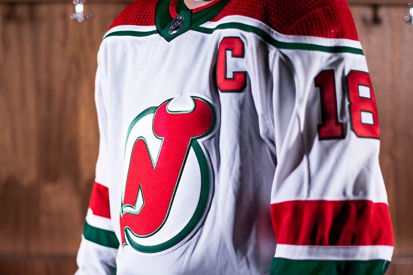
New Jersey Devils
The New Jersey Devils this afternoon announced and unveiled a heritage uniform which the club will wear during the 2018-19 season.
Based off of the Devils red and green home uniform worn during the club’s first ten seasons in New Jersey, the uniform is white with red shoulders, the shoulders trimmed in white and green, the Devils familiar primary logo on the chest in red and green.
It may have been slightly re-coloured or even chromified but in their 36 years playing in the Garden State, the New Jersey Devils have never played a game with anything but the “NJ” logo featured prominently on their chests. Not once.

Edmonton Oilers
The Edmonton Oilers unveiled their new throwback heritage uniform, their home jersey from two seasons ago… that’s all, the only difference is that it’s now on the Adidas jersey cut. Because it’s not officially classified as an alternate or “third uniform” it’ll only be worn four times this year.
Edmonton is bringing back the long-buried uniform (sarcasm implied) for the 2018-19 season to help celebrate the 40th anniversary of the team joining the NHL in 1979.

Carolina Hurricanes....(again)
the Carolina Hurricanes, who previously played as the Hartford Whalers from 1979 through 1997, announced they would wear a Whalers road green throwback uniform for two games in the upcoming 2018/19 season.
Going with the design the Whalers wore from 1985-89 (and then again for the 1990/91 season), the Hurricanes will be in green from head-to-toe, helmets, pants, socks, gloves all match what the Whalers wore during this era.
Carolina was able to work in a subtle reference to tie-in with their current identity, a tonal black and blue storm warning flag pattern on the inside collar.
For more articles on our blog, please visit https://oilfieldjerseys.com/
.thumb.jpeg.36b03074f24803f7038e8b9141ded230.jpeg)

1 Comment
Recommended Comments