
THE 2016/17 NHL OUTDOOR JERSEY CLASS – ALL ABOUT LEGACY

Entry posted by oilfieldhockey
1,041 views
Your Turn To Vote!
-
1. What Was The Best Outdoor Jersey Unveiled In The 2016/17 Season?
-
2016 Winnipeg Jets Heritage Classic0
-
2016 Edmonton Oilers Heritage Classic0
-
2017 Chicago Blackhawks Winter Classic0
-
2017 St. Louis Blues Winter Classic0
-
2017 Toronto Maple Leafs Centennial Classic0
-
2017 Detroit Red Wings Centennial Classic0
-
2017 Pittsburgh Penguins Stadium Series0
-
2017 Philadelphia Flyers Stadium Series0
-
The 2016/17 NHL season has seen the unveiling of 8 NHL outdoor jerseys that were worn in-game by NHL players for their respective NHL teams. Most of the jerseys unveiled were inspired by past designs and colours used in the ‘good ole days’. There have been some interesting classic themed jerseys used this year and most of which are supposed to commemorate team history. Since this is the 100th NHL season, the ‘blast from the past’ route for the Winter Classic and Heritage Classic games made the most sense. The Centennial Classic and Stadium Series jerseys had elements of their past but the designs were brand new and never used before.
-N42241_XL.jpg)
Edmonton Oilers 2016 Heritage Classic
This particular jersey was used prior to the Heritage Classic in Winnipeg when they unveiled it at the 2015 NHL Entry Draft as an alternate. The only reason this jerseys counts on this list is because the Oilers wore it for their outdoor date against the Winnipeg Jets.
What a lot of fans didn’t know about this jersey is that it was the original jersey of the Oilers franchise. When they were the Alberta Oilers in the WHA back in 1972, they introduced this jersey before they changed it to their current blue jerseys a few years after that.
The unique lay-over neck design was not a new implementation of the current throwback, it was also introduced as part of the design back in 1972 as well. Everything about this jersey is according to the exact specifications as the throwback in 1972 except for the white strips separating the blue and orange. The vintage jerseys have a thicker white line than the modern throwbacks played during the Heritage Classic. Besides that, this jersey a true classic.

Alberta Oilers original from 1972

Winnipeg Jets 2016 Heritage Classic
The Jets, just like the Oilers, were part of the WHA until they both absorbed by the NHL. The first generation Jets were inaugurated one year after the Oilers were in 1973. These jerseys are now a fan favourite in Winnipeg after they were worn during their Heritage Classic matinee against the Oilers on October 23rd, 2016. There are 2 exceptions that the new throwback is different from the one introduced in 1973. First, the blue used in the modern throwbacks is a darker navy blue compared to the lighter royal blue from the original sweater. Second, the neck tie from the new jersey is a cross-layover just like the Oilers jersey. The original had a thin cut V-neck.

Winnipeg Jets original from 1973

St. Louis Blues 2017 Winter Classic
The original from 1968 surged back to life after it was unveiled for the 2017 Winter Classic in St. Louis. This jersey proved to be very popular among fans and it immediately replaced the other alternate jersey St. Louis wore since 2008. The round fibre-collar neck added to the true authenticity of the throwback. It’s a simple design that stands out because of the bright colours and that’s why it’s a hit. The main difference between this jersey and the original is the thinner white strip on the new throwback as opposed to the thick white stripes from the original. Thinning out the white is a common theme to the reintroduced throwbacks because it shows off the main colours more.
St. Louis was never part of the Winter Classic until this season and they needed this badly as other rival teams like Chicago and Detroit were already part of several outdoor games already. After the success St. Louis experienced with this Winter Classic, there is strong indication that they will be part of another outdoor game in a few years from now.

St. Louis Blues original from 1968
Chicago Blackhawks 2017 Winter Classic
The Blackhawks are back at it once again with the Winter Classic jerseys. This is Chicago’s 4th consecutive outdoor appearance and it’s 5th overall. They now have a ton of different outdoor jersey designs and it’s a collection that deserves an honour of it’s own. This is also the 3rd straight year that Chicago has went with a white uniform after making their first two appearances in black.
For this jersey, the Hawks modified the throwback from 1958. They made some adjustments with the minor details of the jersey. First, they made the red and black stripes on the waist bigger and they placed the bottom black stripe on the very bottom instead of letting it overhang on top of the white base. Second, they took the “C” from the arm portion of the sweater and completely changed it. All aspects of the secondary logo were changed including the tomahawk ax and ax head portions. The justification for this is because the Hawks already used the original “C” secondary logo in the 2015 Winter Classic jersey and they didn’t want to use it again. They did however use the same main logo from the 1958 original as opposed to before when they used their current logo which is a big positive.
This jersey, similar to the original, is not a true replication of the older version but it still looks great nonetheless.

Comparison between the old and the ‘old new’

Detroit Red Wings 2017 Centennial Classic
This jersey is a very simple design with one significant detail about it; The silver stripes on the arm. Engraved on each silver stripe are the years the Red Wings won Stanley Cups. The years listed on the right sleeve are 1936, 1937, 1943, 1950 and 1952. The years listed on the left sleeve are 1954, 1955, 1997, 1998, 2002 and 2008. Why the stripes are silver is because its supposed to resemble the Stanley Cup. The four red stripes on both sleeves are a tribute to the original Detroit Cougars, which prominently displayed stripes in their jersey designs.

Toronto Maple Leafs 2017 Centennial Classic
Just like their Centennial opponents, The Detroit Red Wings, The Leafs unveiled a simple but fresh design. There is a lot of depth when it comes to the symbolism represented with this jersey. Naturally, it pays homage to the past. The words ‘Honour, Pride and Courage’ stitched into the back of the neck of the sweater, similar to the team’s new sweaters, are taken from a famous Conn Smythe quote and represents the values the franchise strives to represent. The horizontal singular band of white across the body of the sweater is reminiscent of the Toronto St. Pats sweater worn from 1922 to 1925.

Philadelphia Flyers 2017 Stadium Series
Although this jersey is a new design, all of the elements taken from it are meshed from the past.
The new jersey stands as a contemporary homage to the unique characteristics of 50 years of the Flyers uniform – a bold design for a passionate city. The primary colour of the uniform is black, fiercely showcasing the traditional winged-P on the chest. The single dominant orange bands are a reinterpretation of the singular bands of color on the team’s current home and away uniforms. In addition, these bands of colour are complemented by a contrast color name-plate, which is a signature design feature of the Flyers’ NHL uniform.
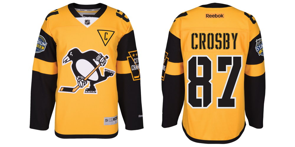
Pittsburgh Penguins 2017 Stadium Series
This is probably the most standout outdoor NHL jersey that has ever been unveiled. There are so many features this jersey has that makes it unique and there is no other like it. This jersey is mean’t to look industrial because Pittsburgh is also known as “Steel City.” The captaincy patches have the gold triangle around it and that golden triangle is normally behind the logo but instead they have it integrated with the “A” and “C” captaincy patches.
The most attention-grabbing feature is the giant patch on the left sleeve touting “City of Champions” in big silver letters. This is the largest secondary patch that was ever featured on a NHL jersey. Inside the patch there are four gold stars, marking the Penguins’ Stanley Cup championships, with crossed hockey sticks all inside a keystone shape — for the Keystone State.
The overall body of the jersey is representative of the first alternate jersey ever used in the NHL and that honour belonged to the Penguins. Those jerseys were worn between 1982 to 1985.
You May Also Like...
LEGACY OF THE CHICAGO BLACKHAWKS OUTDOOR UNIFORM.....So Far
THE RICH CULTURE BEHIND THE PITTSBURGH PENGUINS OUTDOOR SWEATERS
THE HISTORIC COMPILATION OF THE DETROIT RED WINGS OUTDOOR JERSEY
.thumb.jpeg.36b03074f24803f7038e8b9141ded230.jpeg)

0 Comments
Recommended Comments
There are no comments to display.