

Entry posted by oilfieldhockey
1,557 views
Voter Poll
4 members have voted
-
1. What is your favourite NHL alternate jersey?
-
San Jose Sharks' 25th anniversary edition0
-
Anaheim Ducks 'Orange Eggplant' edition0
-
Colorado Avalanche 'Back To The Rockies' edition1
-
Calgary Flames 'Prairie Cowboy' edition0
-
Edmonton Oilers 'Alberta Oilers WHA' edition1
-
Pittsburgh Penguins 'Relive The Glory Days' edition0
-
St. Louis Blues 'Gateway Arch' edition1
-
Carolina Hurricanes 'Black Storm' edition0
-
Nashville Predators 'Enhanced Predator' edition0
-
Ottawa Senators 'Big O' edition1
-
Other0
-
In the past I wrote an article similar to this by listing the top 10 NHL alternate jerseys and there was a rank on them. While it was still interesting, I’m now putting a new twist to this.
Now you get to vote what jersey deserves to be on the top. I would love to see a debate on this because I want to know what aspect in an NHL jersey fans value. I’m only talking about the context, the artistic design and how it presents your roots based on what’s on the sweater. Yes, sometimes your favourite player has wore that jersey and you love that jersey because of that fact but this is not what I’m talking about. Is there a hidden, compelling element of the sweater that you can relate to or is there some visual detail or meaning that sticks out in your mind?
I will announce what you, the fans have chosen what jersey deserves to be on top on the company Social Media pages in a separate post on Facebook and Twitter:
![]()
![]()
We are only going to present jerseys that have been introduced in the post-lockout era. So after the 2005-06 NHL season. Those wacky 90’s jerseys will be saved for another day. Winter Classic and Stadium Series jerseys will also be saved for another day. The list will not include jerseys that were originally alternate then converted as primary home and road jerseys either.
Here is the list of jerseys I am presenting to you and if there is any jersey you want an honourable mention on, let us know in the comment section!
- San Jose Sharks 25th Anniversary Jersey

Introduced in the 2015-16 season, it was only fitting that the Sharks present a jersey that goes back to their roots as it was their 25th anniversary season. To me, this is a very symbolic and iconic jersey. The black alternates they have are awesome as well but this jersey holds a richer history element to it.
- Anaheim Ducks ‘Orange Eggplant’ Jersey
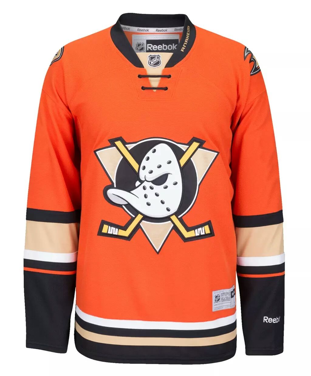
Introduced at the same time as the 25th anniversary San Jose Sharks jersey, the Ducks decided to go back to the history books and incorporate their “Mighty Ducks of Anaheim” eggplant logo. Unlike the Sharks who have went ‘full retro’ with their jersey, the Ducks made a risque move of combining ‘old school’ and ‘mainstream’ and are right now proving to be very popular amongst fans of the Anaheim Ducks but other fans alike who have an interest for the colour design of the jersey.
- Colorado Avalanche ‘Back To the Rockies’ Jersey
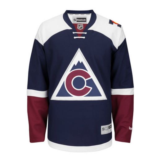
Okay you see the pattern here? Once again introduced in 2015, this jersey was designed to relive the Colorado Rockies days between 1976 to 1982. It was also the Colorado Avalanche’s 20th anniversary so once again, lets relive history and put a modern twist to it. The colour scheme is very well laid out with the logo as the big “C” represents the core of the Colorado State flag fused into what appears to be part of the Rocky Mountains. Oh and if you don’t know what the Colorado State flag looks like, just look at the left shoulder patch of the jersey.
- Edmonton Oilers ‘Alberta Oilers WHA Days’ Jersey

Some call it the ‘McDavid Jersey’ because it was revealed when Connor McDavid was 1st overall in the 2015 NHL Draft. This used to be the Alberta Oilers main jersey when they were in the WHA in the 1970’s. Not too many people knew who the Alberta Oilers were until people who saw this jersey and have the history described behind it. What’s so interesting about this jersey is that when that when Connor McDavid wore the jersey for the first time as it was sequenced with the unveiling of the new jersey, it created a sense of hope and optimism. The Oilers were a cultural mess for years as it lead to bad hockey teams with no meaning and no structure. That feeling of hope and optimism especially held true when the Oilers’ newly acquired ‘generational talent’ was drafted onto their team wearing that jersey. Shortly before, there was a new head coach and new general manager coming into the organization that knew how to win. It was also the first hirings from Oilers in a long time where it wasn’t an Edmonton Oiler alumni player from the glory days of the 1980’s taking the helm. For once, it was strictly help from the ‘outside the Oiler family’ that was brought in take charge. The jersey symbolized a new beginning, not reliving the glory days despite the jersey being considered ‘full-retro.’
- Calgary Flames ‘Cowboy Prairie’ Jersey

Okay cowboy, giddy up. If there is something that resembles what kind of jersey a cowboy would like, this jersey is it. I personally have the EDGE version of this jersey and they are just phenomenal as you appreciate it more in person. It’s not the raw hand writing of the word ‘Calgary’ on the front, it’s the shoulder logo that what intrigued me the most. To me, it looks like a prairie field with a sunset hovering over the Rocky Mountains in the background. You only get that kind of view if you’re looking from East to West only from the Eastern side of the Rockies just west of Calgary. Talk about the depth of thought put into a little, tiny patch shoulder patch.
- St. Louis Blues ‘Gateway Arch’ Jersey
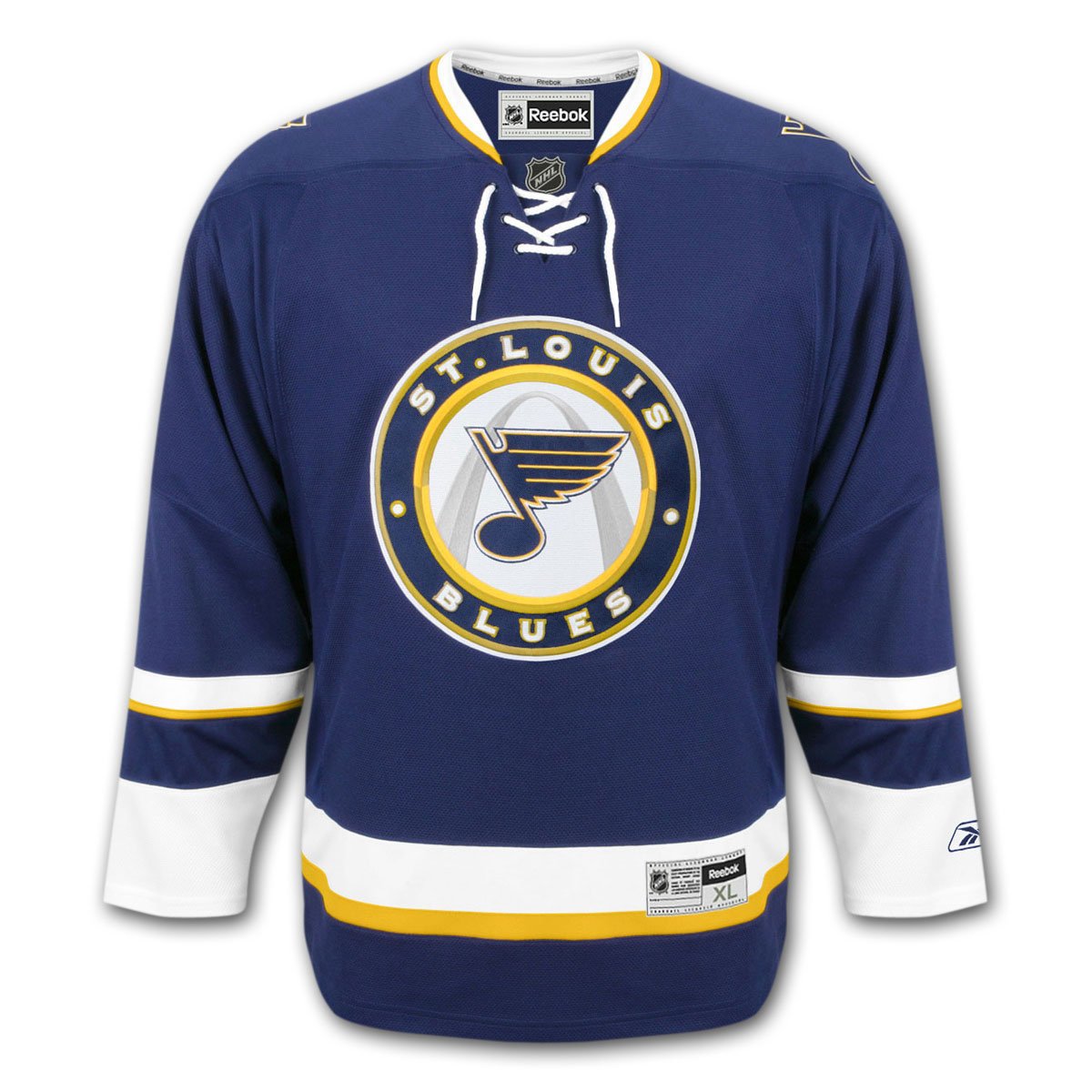
This jersey just makes too much sense. Even though it was introduce in 2008, it’s still a very popular alternate jersey to this day. The ‘Gateway Arch’ is what makes this jersey turn from ordinary to extraordinary as the iconic architectural landmark is super-imposed in the middle of the circular center logo of the jersey. It’s simple but the colour pattern and center logo blends so well with each other. I really think they shouldn’t replace this jersey and keep it as an alternate for a long time. In my mind, nothing much beats it.
- Pittsburgh Penguins ‘Relive the Glory Days’ Jersey

What’s so interesting about this jersey is that this jersey was not inspired by the roots of geological landmarks or Pittsburgh culture, it was about reliving the early glory days of the early 1990’s when Lemieux and Jagr basically dominated the league at that time. Now guys like Crosby, Malkin and Kessel are wearing it in the game and that is totally symbolic of those early 1990’s glory days as we fast forward in time and see what the Penguins are like now. Of course if a jersey is designed to relive the ‘good ol days’ then the jersey has to be a ‘full retro look.’
- Carolina Hurricanes ‘Black Storm’ Jersey

Okay so the Carolina Hurricanes are not a very popular hockey team, but the jerseys that have been unveiled in the last few years are pretty cool and this alternate ‘Black Storm’ jersey is no exception. Since Carolina is an area where a lot of hurricanes take place, it makes perfect sense as to why they called the Hurricanes. The logo on the front side of the jersey represents a storm warning flag with a hockey etched on the side. Very cool when you think about it because the storm warning flag means you got to watch out for the Hurricanes as they hit the ice. The shoulder logo is a ‘blacked-out version of the primary logo used in their home and road jerseys. Overall the use of the colours and the variations of the logos are blended together very nicely.
- Nashville Predators “Enhanced Predators” Jersey

Although it was discontinued, many people think that this a beautiful jersey. The Primary logo is altered a bit from the primary logos in a way that the enhanced version of this logo on the jersey looks tougher, meaner and more predator like especially with those piercing red eyes and silvered face of the Predator. The shoulder logo looks cool as well as it represents an artistic and actual representation of the archaeological discovery of Sabre-Tooth Tiger skull found near the Nashville area. That is also why the Predators are called the Predators in the first place.
- Ottawa Senators ‘Big O’ Jersey

This was an easy choice to incorporate into the list because of how a design so simple and historical can look this good in the modern NHL era. The primary Home and Road jerseys are sub-par compared this beauty. It represents the days of the Ottawa Senators before the NHL even existed. This look was excerpted from the Ottawa Senators when they existed in the 1880’s, 1890’s, 1900’s and 1910’s. Believe it or not the Sens have a history that dates back BEFORE when the Montreal Canadiens first started but in general, the Ottawa Senators roots are relatively unknown and highly underrated due to the fact the franchise folded in 1934 and reintroduced back in 1992. Not an ‘Original 6’ team because of the folding of the team but the history is still as rich as any other ‘Original 6’ team although some will argue this. The shoulder emblems of the jersey represent a shield design that represents strength and solidarity of a nation as it accommodates English speaking and French speaking fans. One of the shoulder logos is the shield that says “Ottawa Senators” in English and the other is the French version that says “Senateurs D’Ottawa.”
So those are the 10 jerseys I have chosen to be on the list but again it is up to YOU decide what’s your favourite and mention a kind of jersey that should be on the list. Looking forward to seeing what the results are.
For more articles, announcements and to shop for officially licensed jerseys, visit The Oilfield Hockey Blog now!
Cheers hockey fans!!!
.thumb.jpeg.36b03074f24803f7038e8b9141ded230.jpeg)

3 Comments
Recommended Comments